
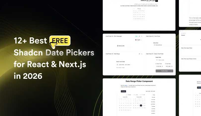
Modern React applications rely on date selection components for everything from booking systems and scheduling platforms to analytics dashboards and admin panels. A Shadcn Date Picker provides a flexible, accessible, and customizable solution built with React, Tailwind CSS, and TypeScript.
In this guide, we tested and reviewed production-ready Shadcn Date Picker components covering single date selection, Date & Time Pickers, Date Range Pickers, Time Pickers, and Multi-language Date Pickers. Each component was evaluated for Next.js compatibility, React Hook Form integration, accessibility, customization, and real-world production readiness to help developers choose the right solution for their projects.
How We Tested These Components
We installed and tested each react date picker in a modern Next.js App Router project to verify real-world compatibility.
We validated every component for:
-
Installation inside Next.js App Router
-
Tested with strict TypeScript mode enabled
-
Controlled and uncontrolled usage patterns
-
Integration with react-hook-form
-
Date range and datetime behavior
-
Timezone handling (where supported)
-
SSR and hydration safety
-
Dependency footprint (react-day-picker, date-fns, etc.)
-
GitHub activity and maintenance status
We only included components that are actively maintained, reusable, and production-ready.
All components listed here are 100% free and open source.
Across the list, you’ll find support for five common date selection patterns:
- Date Picker – Select a single calendar date.
- Date & Time Picker – Select both the date and time in a single component.
- Date Range Picker – Choose a start and end date to filter or book.
- Time Picker – Select hours and minutes without displaying a calendar.
- Multi-language Date Picker – Display localized calendars and regional date formats for global applications.
When you should use a Shadcn date picker
Shadcn date pickers are ideal for:
-
SaaS analytics dashboards for filtering data by date
-
Booking and scheduling systems - for single or range date selection
-
Admin panels with reporting filters
-
Financial tools that analyze data-based metrics
-
CRM systems that track activity history
-
Any application already using shadcn/ui and Tailwind CSS
How to Choose the Right Date Picker
Different applications require different date selection experiences. Choosing the right component depends on how users interact with your application.
| Criteria | What to Check |
|---|---|
| Selection Type | Single date, range, or datetime support |
| Form Handling | Works with controlled inputs and form libraries |
| Styling | Compatible with Tailwind CSS |
| Timezone / Localization | Needed for global or regional apps |
| Customization | Supports custom trigger, popover, or layout |
| Dependencies | Uses modern libraries like react-day-picker or date utilities |
----------
Best Free Shadcn Date Picker Components
Below is a curated list of free, production-ready Shadcn date picker components. Each component has been thoroughly tested for integration with React, Next.js, TypeScript, and Tailwind CSS.
Date & Time Picker
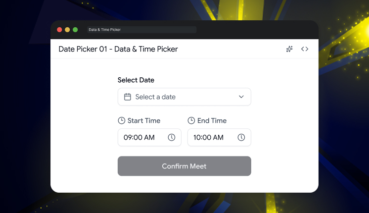
This Shadcn Date & Time Picker allows users to select both a date and a time from a single interface, making it ideal for scheduling workflows. It combines a calendar with time inputs, helping developers build booking systems, appointment forms, event management tools, and SaaS applications without requiring multiple components.
Tech stack: ShadcnUI v3.5, Base UI v1, React v19, TypeScript v5, Tailwind CSS v4
GitHub Stars: 672
Last Updated: July 2026
Key features:
- Select both date and time from one component
- Supports scheduling and appointment workflows
- Easy integration with React Hook Form
- Responsive and accessible interface
- Simple customization using Tailwind CSS
Best for: Booking and scheduling applications.
Date Range Picker
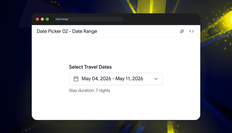
The Shadcn Date Range Picker makes it easy to select a start and end date from a single calendar interface. It is designed for applications that require date-based filtering, reservation periods, reporting, or analytics dashboards. Built with React and Shadcn UI, it provides a clean user experience while remaining flexible enough for production applications.
Tech stack: ShadcnUI v3.5, Base UI v1, React v19, TypeScript v5, Tailwind CSS v4
GitHub Stars: 672
Last Updated: July 2026
Key features:
- Select start and end dates in one calendar
- Perfect for analytics and reporting filters
- Simple state management
- Mobile-friendly calendar interface
- Easy integration into dashboard layouts
Best for: Date filtering and reporting.
Read the full blog here:
