A good combobox can make a big difference in how users interact with your landing page, website or app.
Whether you’re building forms, web pages, dashboards, admin panels, or SaaS products, searchable dropdowns help users find and select options faster while keeping the interface clean and easy to use.
Most developers start with a traditional select component. While it works well for a small number of options, usability often declines as the list grows. Users spend more time scrolling, finding specific items becomes difficult, and forms start to feel less efficient.
That’s where a Shadcn Combobox becomes a better solution.
By combining a input components with a dropdown menu, a combobox helps users find and select options faster while keeping interfaces clean and accessible.
In this collection, you’ll discover some of the Best Shadcn Combobox components for modern React and Next.js applications, including:
- Searchable dropdowns
- Country selectors with flags
- User selection comboboxes
- Multi-select checkbox comboboxes
- Timezone pickers
- Virtualized comboboxes for large datasets
- Linear-inspired combobox patterns
- Advanced filtering interfaces
Whether you’re building a SaaS dashboard, admin panel, onboarding flow, or customer-facing application, these combobox patterns can help improve both usability and efficiency.
Let’s Explore the Best Shadcn Combobox Components
In this blog, we’ll explore 17 real-world Shadcn Combobox examples that demonstrate how searchable dropdowns can improve user experience, simplify complex selections, and create faster workflows in modern web applications.
Basic Combobox
This component provides a simple and familiar way for users to search and select options from a dropdown list. Instead of scrolling through long menus, users can quickly find what they need using the built-in search functionality.


It’s a great starting point for applications that need a clean, lightweight, and easy-to-use selection component.
Key Features
- Searchable dropdown interface
- Fast option filtering
- Keyboard accessible
- Lightweight and easy to customize
- Ideal for forms and settings
Best For: This component is ideal for forms, settings pages, account preferences, dashboard configurations, onboarding flows, and applications that need a simple searchable dropdown without additional complexity.
Popover Combobox
This component displays the dropdown inside a popover, helping keep the interface clean while saving space on the page. Users can search and select options without leaving their current workflow, making interactions feel faster and more organized.
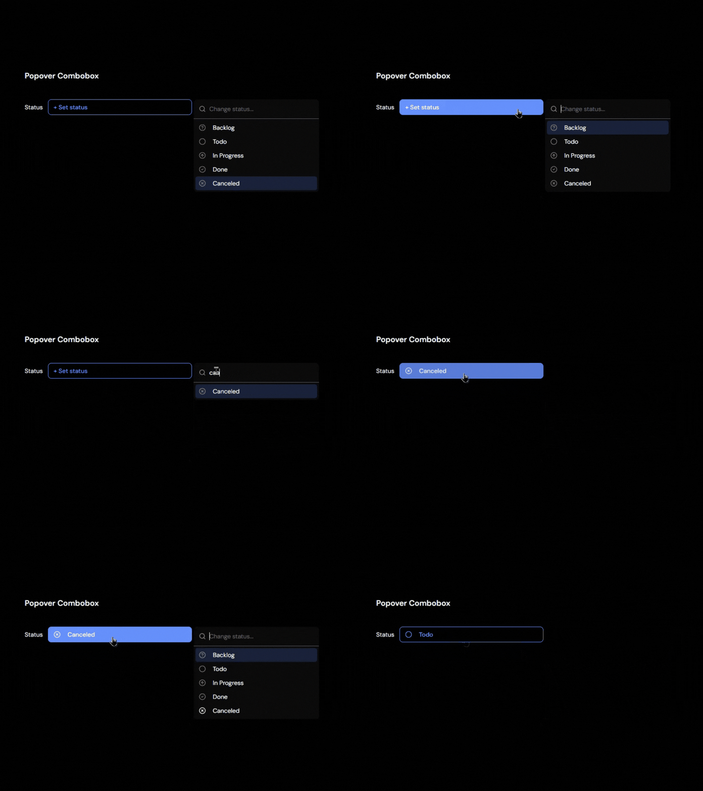
The compact design works especially well in dashboards and applications where screen space is limited.
Key Features
- Popover-based interaction
- Search and filter support
- Compact UI design
- Clear selection feedback
- Works well in dashboards
Best For: This component is ideal for admin dashboards, settings panels, project management tools, data tables, and applications that need a space-efficient selection experience without cluttering the interface.
----------------------------
✅ Read the full original blog post: