Key Takeaways
- Shadcn Sheet is a slide-over panel component built on Radix UI and Base UI primitives, installed via CLI using pnpm, npm, yarn, or bun.
- Each component uses a direct copy-paste approach, compatible with AI-assisted tools such as V0, Lovable, and Bolt.
- The components covered here were evaluated based on real UI usage in SaaS products, developer workflow speed, accessibility support, animation behavior, and production readiness.
- Choosing the wrong panel type (Sheet vs. Drawer vs. Dialog) causes UX and focus management problems that are hard to fix after launch.
Slide-over panels look straightforward until you need to handle dynamic content, nested focus, and mobile responsiveness. Most developers install a basic sheet component, ship the demo code, and spend the next sprint fixing layout shifts and keyboard navigation bugs.
This guide skips the basic setups. We break down production-tested Shadcn Sheet patterns built on React, Next.js, Tailwind CSS, and Framer Motion. You will get the exact copy-paste code for complex workflows, a performance comparison, and a clear framework for choosing between sheets, drawers, and dialogs.
Each pattern is optimized for accessibility, responsiveness, and seamless integration into modern web applications.
What is a Shadcn Sheet?
A Shadcn Sheet is a slide-over panel component that renders content in a layer that slides in from one edge of the viewport. It stays anchored to the screen edge while the main content remains visible behind it. This makes it different from a modal or dialog, which takes full focus and blocks the page.
Shadcn Sheet is built on Radix UI and Base UI primitives, which handle focus trapping, keyboard navigation, and ARIA attributes out of the box. You don’t wire those up manually.
Sheet Anatomy (Composition)
The component ships as a composable set of parts you assemble:
Sheet
├── SheetTrigger
└── SheetContent
  ├── SheetHeader
  │   ├── SheetTitle
  │   └── SheetDescription
  └── SheetFooter
You get the trigger, the content wrapper, the structured header and footer slots, and the overlay. Each part is independently composable, so your team can customize the layout without fighting a monolithic component.
For setup, you can read the official shadcn/ui Sheet documentation or follow the getting started guide to configure the CLI for your project.
When to use a Shadcn Sheet
Not every contextual overlay belongs in a Sheet. Using one in the wrong place creates confusing focus behavior, awkward mobile layouts, and UX patterns that don’t match user expectations.
Use a Sheet when:
- The content is supplemental, and the user may need to reference the main page while it’s open.
- The action doesn’t require a hard decision before the user continues (for example, a filter panel or a cart preview).
- The panel contains a list, form, or scrollable content that benefits from a full side column.
- You want persistent access without navigating away from the current route.
Avoid a Sheet when:
- You need the user to confirm or cancel a destructive action. A dialog is the right choice there.
- The content is short enough to fit in a tooltip or popover.
- You’re on mobile, and the panel competes with swipe gestures. A drawer from the bottom performs better in those scenarios.
Developer Checklist
Before shipping any Sheet component to production, run through this list:

Quick Comparison Table

Best Shadcn Sheet Components and Examples
We evaluated these shadcn sheet components based on real UI usage in SaaS products, accessibility support, animation quality, developer workflow speed, and how well each holds up under production conditions.
Different Directions
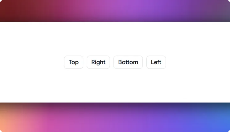
This Sheet gives you 4 directional variants in a single component: top, right, bottom, and left. Most sheet implementations lock you into one direction and require a prop-drilling workaround to change it. This one ships all 4 out of the box, each with its own enter and exit animation managed through Framer Motion. The layout adapts based on the chosen direction without custom CSS overrides.
Use cases:
- Right-side navigation panels in admin dashboards
- Bottom sheet patterns for mobile filter drawers
- Left-side context panels for document editors
- Top notification or announcement banners that slide down
- Multi-directional onboarding overlays in SaaS tools
Best for: Directional slide-over panels in multi-layout apps.
Scrollable Content
This sheet is built for panels that carry more content than the viewport can show at once. Scroll is scoped to the panel interior, so the document body stays locked while the Sheet is open. This solves the scroll bleed problem that appears in long settings forms or multi-section review panels when scroll isn’t properly contained.
Use cases:
- Long onboarding forms with multiple input sections
- Legal terms or policy review panels before submission
- User profile edit sheets with grouped preference sections
- Notification history panels in product dashboards
- Extended data review panels before confirming an action
Best for: Long-form content that exceeds viewport height.
------------------------
✅ Check out the original post: