Forms are one of the most important components of every web project.
Whether users are updating profiles, managing subscriptions, onboarding team members, completing checkouts, or submitting applications, forms are one of the most important components in any modern web application.
You suddenly need validation states, keyboard navigation, error announcements, multi-step flows, dynamic field arrays, and consistent spacing inside nested dashboard layouts
Most form examples online handle none of this well.
This is where Shadcn UI forms stand out.
A good form does more than collect information. It helps users complete tasks quickly, reduces errors, supports keyboard navigation, and creates a better experience across devices.
Combined with tools like React Hook Form or TanStack Form, developers can build accessible, scalable, and easy-to-maintain form experiences for modern applications.
In this collection, we’ll explore some of the Best Shadcn form examples, form layouts, and form components that work particularly well for admin dashboards, SaaS platforms, internal tools, and business applications.
Why Use React Hook Form or TanStack Form with Shadcn UI?
Before selecting a Shadcn form template, it’s important to choose the right form management tool.
By combining Shadcn UI with React Hook Form or TanStack Form, developers can build accessible, scalable, and production-ready form systems that fit modern admin dashboards.
React Hook Form is one of the most popular choices for building forms in React applications.
Key benefits:
- Minimal re-renders because it relies on uncontrolled inputs.
- Native Zod integration through "zodResolver" for schema validation.
- Strong TypeScript inference across fields and form values.
- Large community, so most edge cases already have answers.
TanStack Form is designed for complex applications that need powerful state management.
Key benefits:
- Field-level validation that runs independently per input.
- Flexible state handling for deeply nested or conditional forms.
- Framework-agnostic core that scales across large applications.
Both libraries integrate well with Shadcn UI form components and help create accessible user experiences.
Let’s explore the best shadcn forms
Every Shadcn UI form below was evaluated on accessibility support, validation handling, and how well it holds up inside admin dashboards, SaaS platforms, internal tools, and business applications.
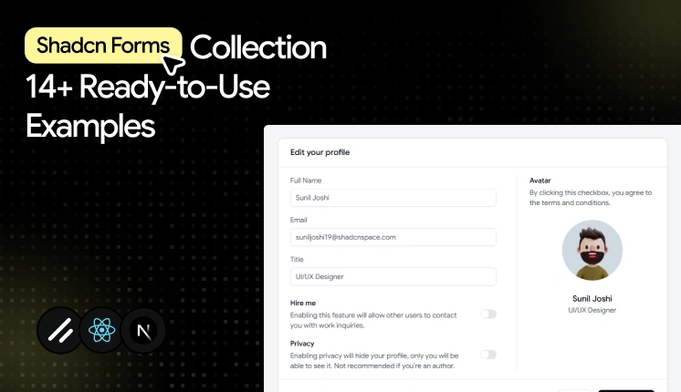
Below are 14 Shadcn form templates and examples worth keeping in your shadcn resources.
Multipurpose input form
This is more than a basic input form. Along with standard fields like email and phone number, it includes commonly used form components such as file upload, checkbox, radio buttons, and toggle switches, making it a complete starting point for many dashboard workflows.
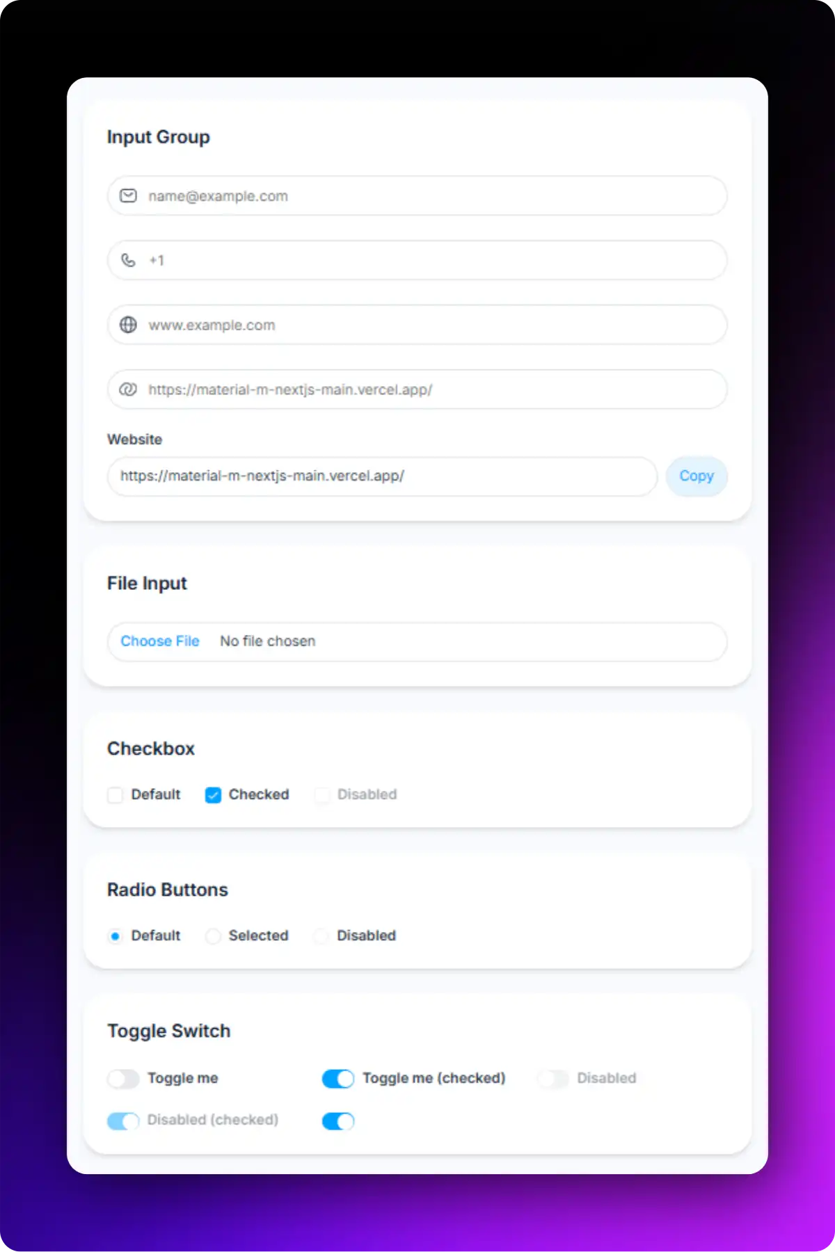
Accessibility highlights:
- Each input connects to its own FormLabel and FormControl for screen readers.
- Validation errors are rendered through FormMessage and are announced appropriately.
- Keyboard tab order follows the visual field sequence.
- Interactive components such as checkboxes, radio buttons, and switches are fully keyboard accessible.
- File upload fields include proper labeling for improved usability.
Best for: Registration forms, contact forms, account creation, and customer information collection.
Text area input form
This Shadcn form example uses one text area with clear validation states. This simple form pattern appears frequently in customer support systems, community platforms, and feedback modules.
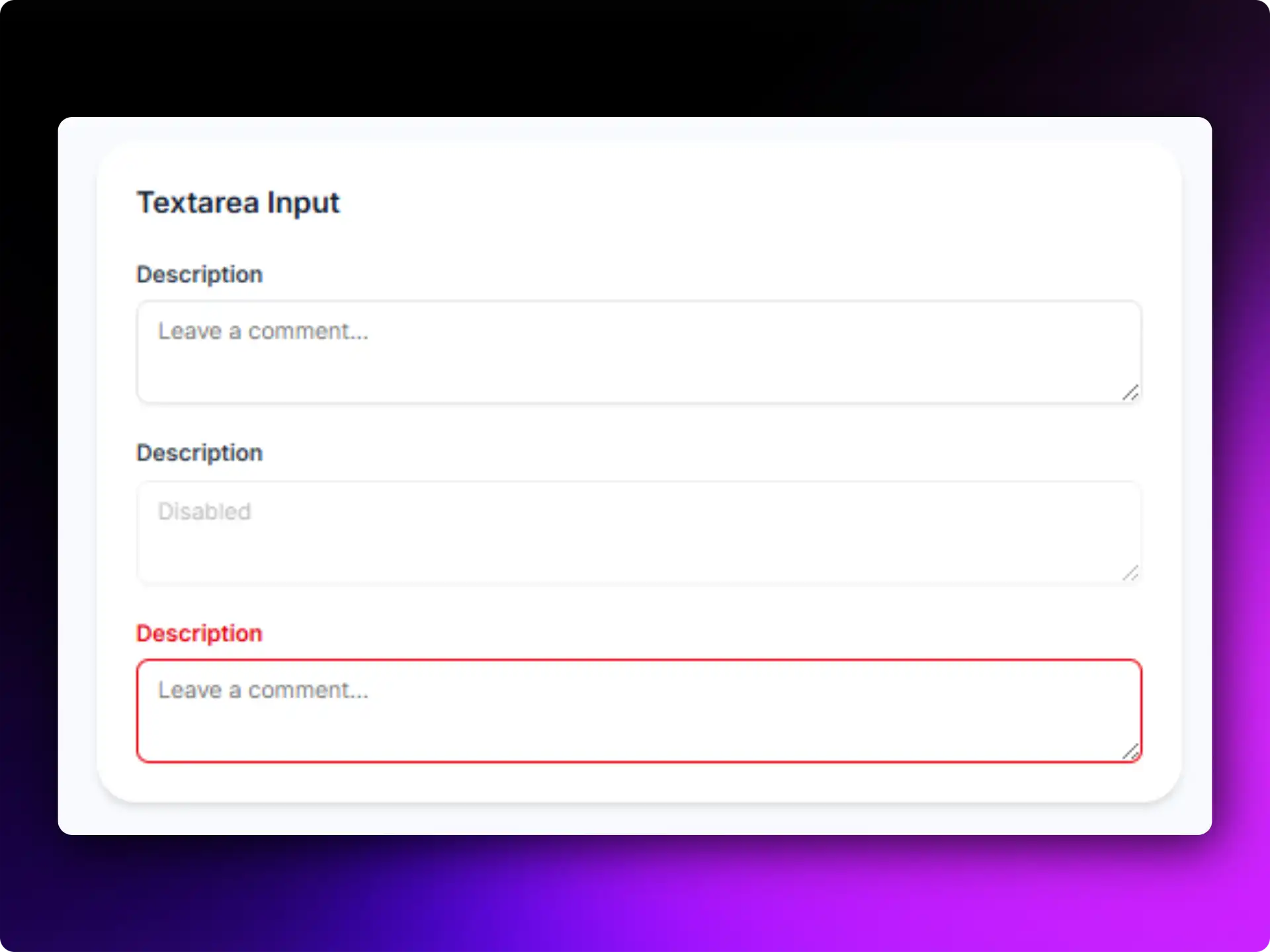
Accessibility highlights:
- Large typing area
- Clear placeholder guidance
- Screen-reader friendly labels
- Responsive form design
Best for: Comments, support tickets, reviews, and feedback collection.
---------------------
✅ Read the original post here -