
Key Takeaways
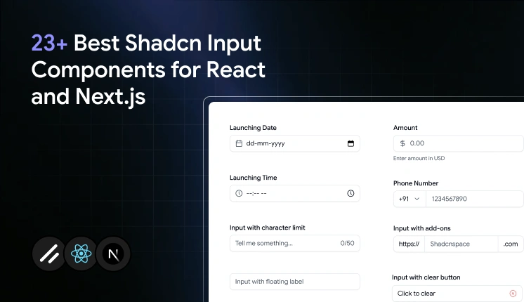
- There are 23 Shadcn input components covered here, spanning single-line fields, multi-line textareas, and OTP inputs, including Date, Time, Currency, File, Real-time Validation, Character Counters, Floating Labels, Inline Buttons, Form Textarea, Textarea with Label, OTP Input, and OTP Input Separator.
- Every component installs with a single CLI command using pnpm, npm, yarn, or bun , and the source code is copied directly into your project.
- Components are built on React, Next.js, Tailwind CSS, and Framer Motion , and support both Radix UI and Base UI primitives.
- You own every line of code after installation. There is no runtime dependency, no version lock-in , and nothing to fight when you need to change behavior.
- These components are designed to work well with React Hook Form and validators like Zod or Yup, including the Form Textarea variant, which ships with a complete Zod schema and error messaging out of the box.
- OTP inputs support pattern constraints, controlled state, and visual separators for grouped code entry, making them production-ready for auth and verification flows.
- The core input collection emphasizes accessibility features such as keyboard navigation, focus states, and screen reader support .
You start a form with a single <input> tag. Then the real requirements show up. You need focus rings that match your design system, error states that read correctly to screen readers, a currency field that stays controlled, a password field with a live strength meter, and a file picker that does not look like a 2003 browser default. Suddenly, that one input has turned into a week of edge-case work.
That is the gap these Shadcn Input components close. All components are free, built on React, Next.js, Tailwind CSS, and Framer Motion, and they support both Radix UI and Base UI. You install each one through the official Shadcn CLI using pnpm, npm, yarn, or bun. The code lands directly in your project, so you own every line and can edit it without fighting a package version.
What is Shadcn Input?
A Shadcn Input is a styled, accessible text field you copy into your codebase instead of pulling from a packaged UI library. It uses native HTML input behavior underneath, then layers Tailwind CSS styling and Radix or Base UI primitives on top for focus management and accessibility. The point is ownership. You get readable component code in your components folder, not a black box you import and hope behaves.
This matters because most input libraries trade control for speed. You ship fast, then get stuck when you need to change a focus outline or fix a hydration mismatch in Next.js. Here, the logic sits in your project, so you change behavior directly.
Why Input Matter
Inputs look trivial until you count what a single field needs in production. A login form alone wants validation, error messaging, focus states, keyboard navigation, autofill handling, and screen reader labels. Multiply that across signup, checkout, settings, and search, and the input layer becomes one of the most repeated and most bug-prone parts of your UI.
Hand-rolling each variant creates three recurring problems:
- Accessibility drift. Custom inputs often skip proper aria wiring and keyboard focus, which fails audits later.
- Inconsistent states. Disabled, invalid, and read-only styling diverges across pages when each dev builds their own.
- Validation glue. Wiring fields to React Hook Form and Zod by hand gets resolved on every project.
Prebuilt variants fix this once. You get consistent states, working accessibility, and form-library compatibility from the start. That is the reason teams reach for them instead of rewriting the same field.
How I evaluate these input components for production use
Each component on this list was evaluated against five criteria that matter in production, not in a demo:
- Keyboard and screen reader accessibility – does it pass audit without manual fixes?
- React Hook Form compatibility – does it slot in cleanly without custom wiring?
- Controlled-state behavior – does it stay predictable when value is managed externally?
- Animation quality – does motion hold up in real layouts, not just isolated previews?
- Rewrite cost – how much do you need to change before it ships?
If a component failed any of these in a real form context, it did not make the list.
Developer Checklist
Run through this before you wire any input into a form. It catches the issues that usually surface after launch.
- Controlled vs uncontrolled: Decide upfront. Use controls for currency, validation, and counters.
- Accessibility: Confirm label association, keyboard focus, and
ariawiring on each field.
- Validation: Connect to React Hook Form with a Zod or Yup schema instead of ad-hoc checks.
- States: Test focus, disabled, read-only, and invalid styling in your actual theme.
- Next.js hydration: Verify no server and client mismatch on fields with dynamic values.
- Package manager: Match the install command to your project (pnpm, npm, yarn, or bun).
- Theme tokens: Confirm spacing, radius, and color match your design system after install.
- Mobile: Check spacing and tap targets on small screens, especially inline-button variants.
Quick Comparison Table
| Component | Best For | Key Feature |
|---|---|---|
| Input with Date | Scheduling and booking forms | Native date selection with styled field |
| Input with Time | Event and Appointment Forms | Time entry with consistent formatting |
| Input with Currency | Pricing and checkout flow | Controlled value with currency formatting |
| Form Textarea | Multi-line forms with validation | React Hook Form + Zod schema with error messaging |
| Real-Time Validation | Password and signup fields | Live rule checks as the user types |
| Input with Start Select | Phone and Country Fields | Leading select for prefixes |
| Input with Character Counter | Bios and limited-length fields | Live character count against a limit |
| Input with Controls | Quantity and stepper fields | Increment and decrement buttons |
| Input with Add-ons | URL and domain uses | Fixed prefix or suffix text |
| Input with Floating Label | Compact form layouts | Animated floating label |
| OTP Input | Authentication flow | Multi-slot code input with constraints |
| Input with Clear Button | Search and filter by words | One-click clear input |
| Input with End Inline Game | Inline operation inputs | Button embedded inside the field |
| Input with End Button | Newsletter and subscribe forms | Attached the submit button |
| Input with File | Upload forms | Styleddi picker |
| Input with Error | Form check states | Built-in rescan |
| Required Input | Mandatory effects | Required indicator + validation cue |
| Standard Input | Square text entry | Base-styled input component |
| Input with Label | Accessible form fields | Label correctly wired to the input |
| Disabled | Read-only fields | Clear, non-editable styling |
| With Animated Checkmark | Success feedback | Framer Motion validation checkmark |
| Textarea with Label | Support and contact forms | Labeled multi-line input |
| OTP Input Separator | Grouped verification of individuals | Project grouping separators |
Installation
Each component installs through the Shadcn CLI . Run one command, and the source code, dependencies, and file placement are handled for you. Here is the pnpm version for the first input:
pnpm dlx shadcn@latest add @shadcn-space/input-01
The same command works across package managers. Swap the prefix for npm, yarn, or bun:
npx shadcn@latest add @shadcn-space/input-01
yarn dlx shadcn@latest add @shadcn-space/input-01
bunx shadcn@latest add @shadcn-space/input-01
You need an existing React or Next.js project with shadcn/ui initialized first. If you have not set that up, the getting started guide walks through configuring the CLI, and the CLI page covers registry setup. Prefer watching it run end-to-end? Here is the setup video on YouTube.
Best Shadcn Input Components
You have seen the table. Now, here is what each component does, where it fits, and the one job it does best.
Input with Date
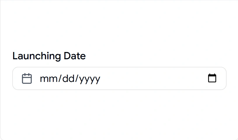
Date fields break the moment you hand-style a native picker, and it renders differently across browsers. This component keeps native date selection but wraps it in a styled field that matches the rest of your form, so the calendar input no longer looks out of place. It stays controlled, which means you can read and set the value cleanly in React state or React Hook Form. Use it anywhere a user picks a single day without you building a custom calendar.
Uses:
- Booking and reservation forms
- Launch or publish date selection
- Profile fields like date of birth
- Deadline and due-date entry
- Filter ranges in dashboards
Best for: Scheduling and booking forms that need a clean date field.
Input with Time
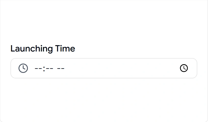
Time entry sounds simple until you deal with formatting, AM/PM handling, and alignment with a date field next to it. This component gives you a styled time input that stays consistent with your date field and keeps its value controlled. It pairs naturally with the date variant for full datetime flows. Drop it into any form where the exact time matters as much as the day.
Uses:
- Appointment and meeting scheduling
- Event start and end times
- Reminder and alarm settings
- Shift or availability forms
- Delivery window type
Best for: Event and appointment forms that capture a precise time.
Explore Input with Time
------------------
✅ Check out the original blog post: