
Key Takeaways
- Shadcn carousel components provide sleek and customizable designs for React and Next.js applications.
- They offer responsive layouts, ensuring a seamless user experience across different devices.
- Easy integration with extensive documentation makes them developer-friendly.
- These components are optimized for performance and accessibility, catering to diverse user needs.
- Leveraging Shadcn carousels can significantly enhance the visual appeal and functionality of your web projects.
Carousels have a reputation for being tricky to get right. The logic seems simple until you need custom navigation, accessible controls, and smooth touch behavior all at once. Then most off-the-shelf options either expose too little or collapse under real project requirements.
Shadcn carousels are different. Built on top of Embla, they give you a composable, Tailwind-friendly slider that works with your existing component structure instead of around it. You get swipe support, keyboard navigation, and direct API access without stitching together three separate libraries.
This post covers the best Shadcn carousel components. For each one, you will see what it does, where it fits, and when to use it so you can make a clear call without reading through a wall of docs first.
What is Shadcn Carousel?
A shadcn carousel is a slider component that lets users move through multiple items in the same space, left to right or top to bottom. Instead of stacking content into a long page, you let people swipe or click through it.
The official shadcn ui carousel is built using Embla, a lightweight engine that handles the hard parts: drag physics, snap points, and slide tracking. On top of Embla, Shadcn exposes a clean React carousel component you can compose and style with Tailwind.
The official docs cover the full surface: composition, orientation, options, API, events, plugins, RTL, sizes, and spacing. The Radix UI and Base UI versions share the same mental model, so what you learn on one carries over.
How These Carousels Were Evaluated
Each pattern in this list was evaluated against a fixed set of developer-focused criteria. Surface appearance was not part of the filter. Here is what actually mattered:
- Implementation clarity: predictable structure you can read and extend.
- Composition flexibility: container, content, item, and controls stay separate and reusable.
- Navigation patterns: dots, arrows, and index states that map to clear user actions.
- Keyboard support: arrow keys and focus handling that work out of the box.
- Touch behavior: swipe gestures that feel natural on real devices.
- Layout control: sizing and spacing you can adjust without rewrites.
- Workflow fit: copy-paste usage that drops into a React or Next.js project cleanly.
Every component below is evaluated against the same criteria, so you can compare them on equal footing and pick the one that fits your project without second-guessing.
Stack and Setup
All components below work in both Radix UI and Base UI setups. They follow a direct copy-paste workflow, so you paste the code, wire your data, and move on.
These patterns are built with React, Next.js, Tailwind CSS, and Framer Motion, which keep animation and slide transitions smooth without heavy config.
You can install each pattern through a CLI command using pnpm, npm, yarn, or bun. Here is one sample install line for pnpm:
pnpm dlx shadcn@latest add @shadcn-space/select-01
For more information and better clarity, visit our official get started guide with the CLI.
Why Developers Still Use Carousels Today
Carousels get a bad reputation, usually because of autoplay banners nobody asked for. Used well, they solve a real layout problem.
You reach for a carousel when you have more items than vertical space, and order does not strictly matter. Product galleries, testimonials, feature previews, and onboarding steps all fit. A Next.js carousel built on Embla also keeps slide content in the DOM, which helps with indexing when you render it server-side.
The point is control. Swipe on mobile, arrow keys on desktop, and a layout that does not blow up your page height.
Best Shadcn Carousel Components Examples
Below are examples of carousel components that score highly in usability, performance, and accessibility. Each Shadcn component has been carefully reviewed to ensure it aligns with the outlined criteria.
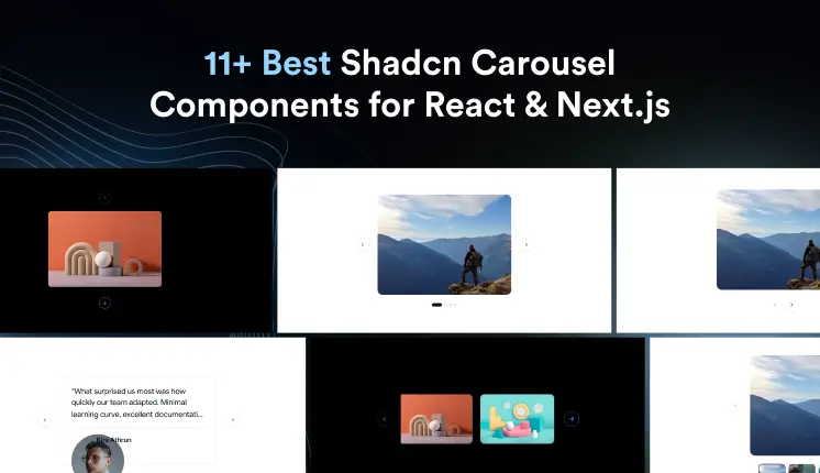
Custom Dots

This pattern replaces default arrows with dot indicators that track the active slide, giving users a clear sense of position and total count. It keeps the navigation compact, which works well when arrows would crowd a tight layout. The dots are wired to the carousel API, so the active state stays in sync as users swipe or click. You get a clean, minimal control surface that scales from 4 slides to many without clutter.
Use cases:
- Image galleries where space is tight
- Onboarding flows with a fixed number of steps
- Hero sections that need quiet navigation
- Mobile-first sliders driven by swipe
- Marketing pages with 4 to 6 highlight slides
Best for: Compact image galleries that need position cues without bulky arrows.
Custom Navigation

This pattern hands you full control over the previous and next buttons, so you can restyle, reposition, or relabel them to match your design. It is useful when default controls clash with your brand or sit in the wrong spot. The buttons connect to the carousel API and respect disabled states at the start and end of a non-looping set. You keep accessibility intact while shaping the controls to fit your layout.
Use cases:
- Branded sliders with custom arrow styling
- Layouts where controls sit outside the track
- Dashboards need larger touch targets
- Editorial pages with directional cues
- Sliders that mix custom buttons with keyboard support
Best for: Branded interfaces where default arrows do not fit the design system.
-----------------------------------------------------------------------
✅ Read the full original blog post: