
Posterization has a bad reputation among people who edit photographs, and I think it is earned in most cases. The effect is usually applied as a filter: one click, a slider dragged to taste, and a picture that looks broken. My reading is that the tool is fine and the order of operations is wrong. A reduced palette is a design decision, closer to choosing a screen-print ink set than to adjusting exposure, and it rewards anyone who decides the number of tones before touching anything else.
What posterization actually does
Under the surface, posterization is bit depth reduction. Each colour channel is quantized into N equal steps, so a picture carrying 256 tones per channel is squeezed down to anywhere between 2 and 255 levels. With three channels, the multiplication is unforgiving: eight levels of red, eight of green and eight of blue describe 512 possible colours, and the eye registers the loss long before it registers the arithmetic.
There are two ways to express that reduction, and they are not the same control. Levels per channel set a staircase for red, green and blue independently. An exact colour count instead picks a palette across all three channels at once, which is why a setting of eight means eight colours in total rather than eight steps in each channel. Moving between tools without noticing which of the two is on offer explains a lot of confusing results.
The bands are the point and the problem. Tones that sat close together fall into the same bucket and flatten into one area of solid colour. Do that across a whole image and you get the graphic look; do it where tone was changing slowly, as in skin or a sky, and you get contour lines that read as damage rather than style. I find it useful to think of every band as a decision about which distinctions the picture can afford to lose.
A pop art portrait makes the mechanism plain. Four levels turn lips and cat-eye sunglasses into blocks of bright red on a cyan ground, not because the face was simplified but because the tonal ranges that separated the features were merged into a handful of buckets, and the features survived as shapes.
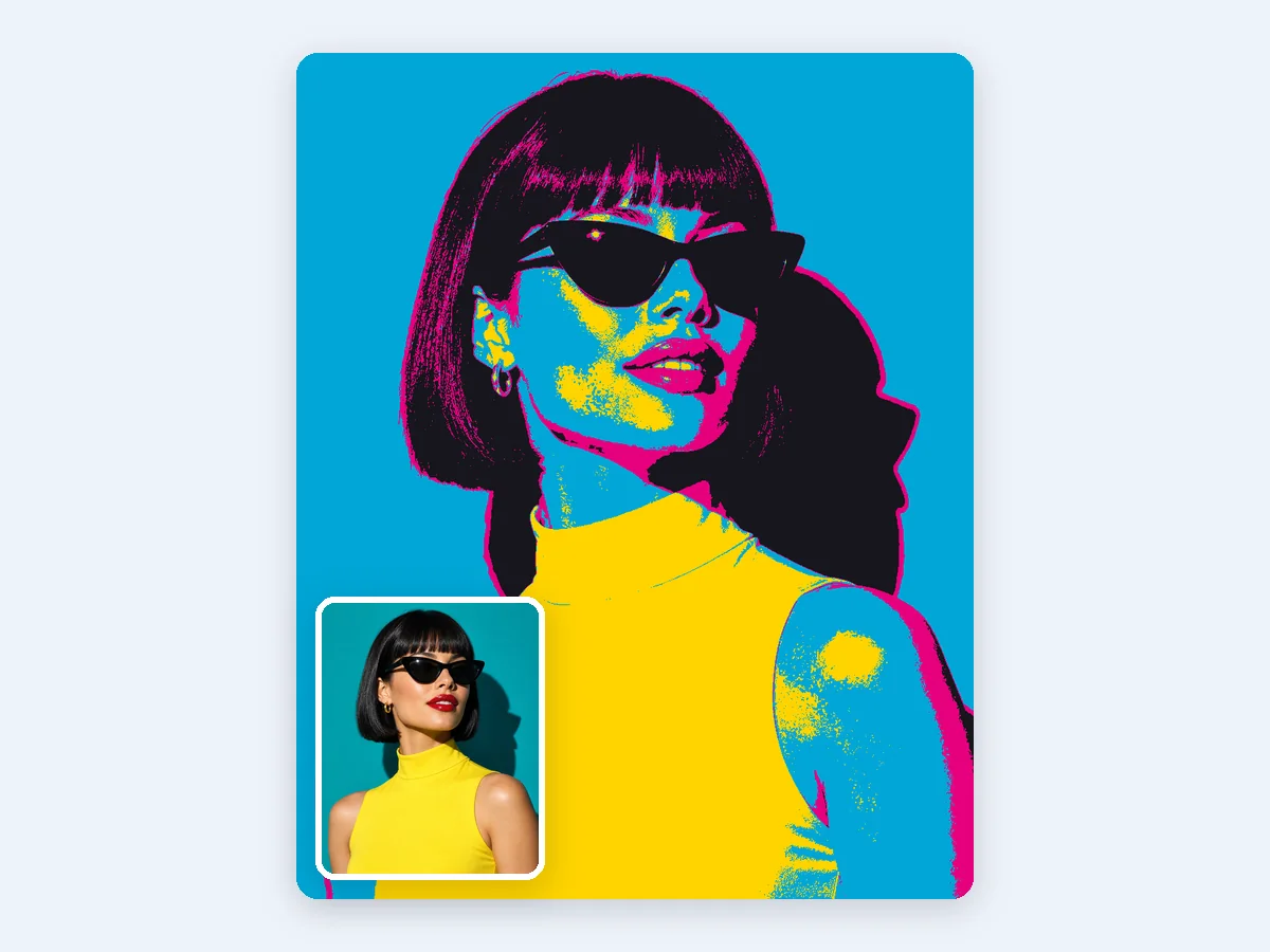
Four levels mapped to a pop palette turn lips and sunglasses into flat blocks of color
The two controls that matter
Levels decide how many flat steps the image is allowed. Fewer levels give a stronger graphic quality and more banding; more levels preserve gradation and lose the poster character. This is the control with the most visible effect and the one worth adjusting first.
Smoothing decides which edges survive quantization. The published work on this is instructive: one technical report on posterization with fuzzy logic and bilateral filtering describes the filter as blurring the given image to remove small details, with the stated reason being to remove small details before the quantization process. The bilateral filter smooths while preserving edges, so large shapes come through the reduction intact and fine texture does not turn into speckle. That sequencing, smoothing before quantization rather than after, is the whole principle in miniature.
Dithering is the third lever when a gradient has to survive. It spreads the rounding error across a dot grid, trading clean flats for the illusion of a gradient. A hot-air balloon scene over a canyon in levels with ordered dithering keeps the sunrise transition as a fine pattern and takes on a retro print character; without dithered dots, that same sky would break into a few hard bands. Neither result is better, but they suit different pictures.
Match the setting to the subject
Portraits and pop art want a very low count. Around four levels is enough to turn skin, lips and glasses into readable blocks of bright colour, and adding more tends to muddle the graphic reading rather than improve the likeness. The gain here is graphic impact, so resist the urge to protect detail.
Scene posters sit in the middle. Single digits, around five or six, applied with smoothing, let lights and foliage merge into clean shapes instead of noise. I tested this reading against the alpine lake travel poster among the examples, where pines, a canoe and mountains at dusk hold together in six flat colours and pick up the look of a vintage national park print. Six is not a magic number, but it is a sensible starting point for a landscape with several overlapping planes.
Stencils and cut shapes push further, toward two tones and then clean up. A cut pattern needs unambiguous edges rather than texture, so the question stops being how much tone to keep and becomes which boundary to draw. The monstera leaf stencil follows that logic: the leaf reads as a single cut silhouette because the tonal information between veins and leaf surface was removed rather than merely compressed.
Custom palettes are their own case. Where an image has to print consistently across a mug, a tote bag or a T-shirt, choosing a few brand colours and mapping the picture onto them makes the output predictable in a way that tuning levels cannot. A Shiba Inu portrait in three custom colours is the clearest demonstration of that use.
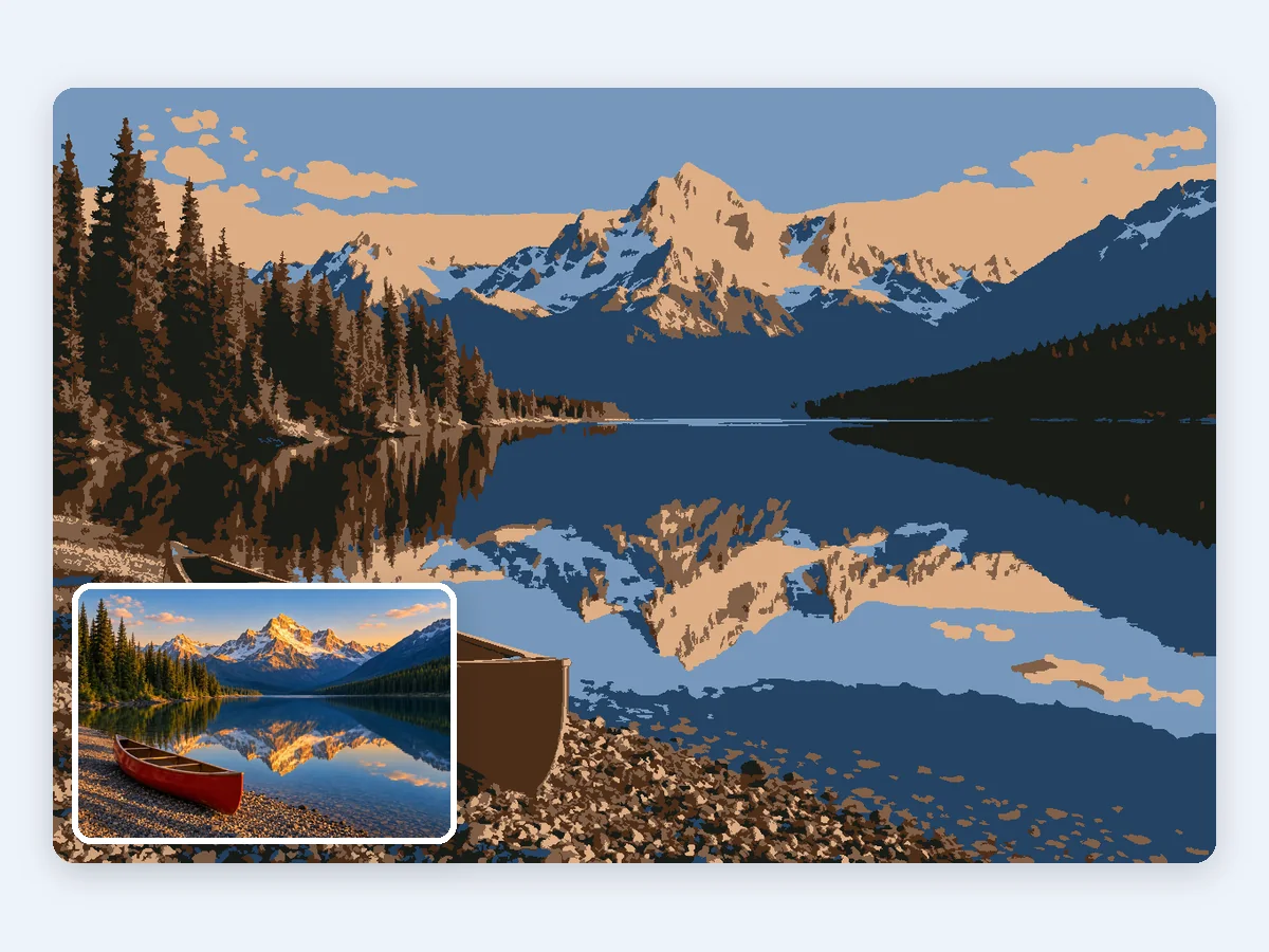
Six flat colors give a dusk lake scene the look of a vintage travel poster
Common mistakes
The most frequent error is posterizing before smoothing. Quantizing noise and grain produces speckled patches where flat areas were intended, and no amount of level adjustment repairs it afterwards. Smooth first, then reduce.
A close second is treating the level slider and the colour count as interchangeable. They describe different things, and results jump wildly between tools because one is asking for steps per channel and the other for colours overall. Reading which one is on the screen is worth more than any preset.
Then there is the expectation problem. A posterized file is still a full-colour raster. A stencil needs thresholding and vector tracing after posterization, and a print job may need colour separation, so the reduced image is an intermediate rather than a finished asset. Confusing a flat look with a cuttable file causes a lot of rework.
The last mistake is assuming an undo. Posterization discards tone irreversibly, so the original must be kept. Once 256 tones become four, the missing values cannot be recovered, and an over-reduced image has to be rebuilt from the source.
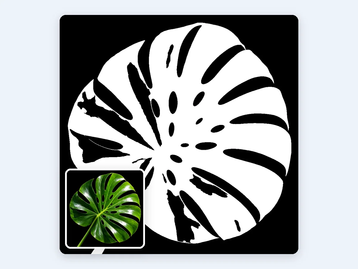
A near two-tone treatment leaves the leaf outline clean enough to cut as a stencil
A practical workflow that keeps the original
The routine I would follow starts with a duplicate, never the working file. Posterize the copy, then compare it side by side with the original and step the levels down one at a time until the shapes read clearly. Watching the reduction in increments is far more instructive than guessing a final number, because each step shows which distinction was load-bearing.
This is also where a browser tool earns its place. ImageToPsd.AI runs posterize in the browser with nothing uploaded, offering levels per channel or an exact colour count and preset examples you can open and adapt, which makes it easy to try a setting, look at it against the source and try again without a round trip. Free, no sign-up, with the original resolution and DPI kept, it suits the experimenting stage of exactly this workflow.
Once a setting works, the next question is what the image has to become. If the result needs separate subject and background for a layout or a listing, the reduced picture can go into a layered editor from the same place, since a result can be sent to the next tool without downloading it first. Posterization then stops being the end of the job and becomes one step in preparing one picture for several outputs.