Renovating a small retail space sounds straightforward until you actually start planning it. On paper, you have a fixed area, a rough idea of where products should go, and a basic assumption that “good design” will naturally emerge once things are arranged neatly.
In reality, most layout decisions happen too early and get locked in too quickly.
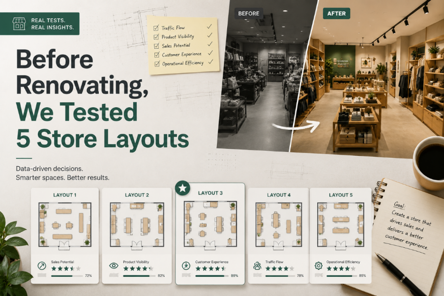
That was the reason we decided to approach the renovation differently. Instead of committing to a single layout and refining it, we tested five different store configurations first using Floor Plan Maker, then evaluated them as if we were observing real customer behavior.
The results were not what we expected.
Why We Didn’t Start With “The Best Idea”
The original plan was simple: design a clean, efficient layout and execute it.
But the more we discussed it, the clearer it became that we were guessing.
We had assumptions like:
● customers prefer wider aisles
● checkout should be at the back
● product visibility matters more than density
● entrance flow should be linear
These assumptions sounded reasonable, but none of them were validated for this specific space.
So instead of debating opinions, we used Floor Plan Maker to generate multiple layout variations quickly and treat them as experiments rather than final answers.
Layout 1: The Standard Grid (Safe but Predictable)
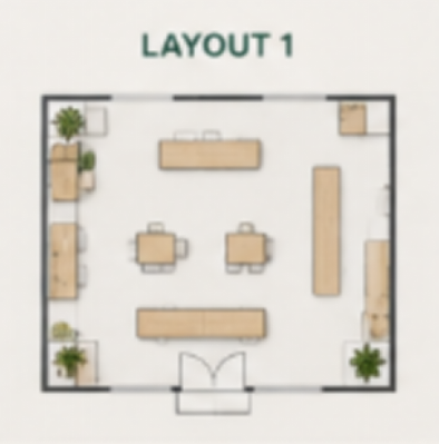
The Standard Grid
The first layout followed a traditional retail structure:
● straight aisles
● evenly spaced shelves
● checkout positioned at the back wall
At first glance, it looked “correct.”
But when we analyzed it more carefully, several issues appeared:
● the entrance area felt empty and underutilized
● customer movement was too linear
● no natural stopping points for browsing
It was efficient, but not engaging.
This layout felt like something built from a template rather than designed for behavior.
Layout 2: Central Flow Design (Optimized for Movement)
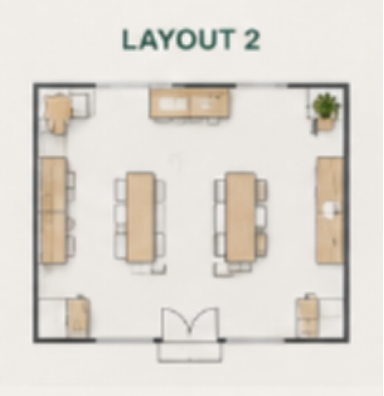
The second version from Floor Plan Maker introduced a central circulation path.
Instead of straight aisles, the layout guided movement in a loop around a central display zone.
This immediately changed how the space felt.
Strengths:
● natural movement loop
● better product exposure
● stronger visual focus in the center
Weaknesses:
● reduced shelving capacity
● slightly more complex navigation for first-time visitors
This was the first layout where we realized efficiency and experience are not the same thing.
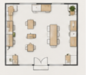
Layout 3: Open Entry Concept (Designed for First Impressions)
This version focused heavily on the entrance experience.
We removed most structures near the front and created an open “welcome zone” before product areas began.
Generated through Floor Plan Maker, this layout emphasized openness and visibility.
Observations:
● strong first impression
● easier entry flow
● but delayed product engagement
Customers would enter comfortably—but take longer to interact with products.
This created an interesting trade-off: comfort vs conversion speed.
Layout 4: Dense Retail Optimization (Max Capacity Model)
This version prioritized one thing: maximizing shelf space.
It pushed product density higher and minimized walking gaps.
On paper, it was the most “efficient” use of space.
In practice:
● movement felt constrained
● visual clarity decreased
● browsing behavior became harder to predict
Even though Floor Plan Maker generated a logically valid layout, it exposed a key truth: maximizing space utilization often reduces shopping quality.
More is not always better.
Layout 5: Asymmetric Flow Experiment (The Unexpected Winner)
good store layout
The final version was the least conventional.
Instead of symmetry or structure-based planning, it used a slightly diagonal flow:
● entrance angled toward featured products
● shelves arranged in staggered sections
● checkout positioned near a natural exit path
At first, it looked unusual compared to standard retail layouts.
But when we simulated movement mentally, it felt the most natural.
Why it worked:
● guided attention instead of forcing structure
● created natural stopping points
● balanced exploration and direction
This was the only layout where we didn’t feel the need to “fix” anything immediately after generation in Floor Plan Maker.
What Changed When We Compared All Five
Looking at all five layouts side by side revealed something important:
There is no universal “best store layout.”
Each version optimized something different:
● Layout 1 → structure
● Layout 2 → flow
● Layout 3 → entry experience
● Layout 4 → capacity
● Layout 5 → behavior
The decision was no longer about finding the best design.
It became about choosing which behavior we wanted to encourage.
The Real Role of Floor Plan Maker in This Process
What stood out most was not the individual layouts, but how Floor Plan Maker changed the process itself.
Instead of:
● designing → refining → committing
We ended up:
● generating → comparing → interpreting
The tool didn’t remove decision-making.
It made decisions visible earlier.
And that changed how discussions happened. We stopped arguing about opinions and started analyzing consequences.
Key Insight: Renovation Is a Decision Problem, Not a Design Problem
Before this experiment, we assumed renovation success depended on design quality.
After testing five layouts, it became clear that design quality is secondary.
The real challenge is decision clarity:
● What behavior matters most?
● What should be prioritized: flow or capacity?
● Where should attention naturally go first?
● What experience should dominate the space?
Once these questions are answered, the layout almost designs itself.
Tools like Floor Plan Maker simply make those outcomes visible faster.
Final Thoughts
We didn’t find one perfect layout.
Instead, we discovered that the “best” store design depends entirely on what you choose to optimize for.
What surprised us most was how quickly assumptions broke once we saw multiple real alternatives side by side.
Renovation stopped being about finding the right design.
It became about understanding trade-offs.
And that might be the most important lesson of all.