★ CSS3 スライドショーのやり方②(アメンバー限定記事内で)
★ 反転。
● 内容。
① 下記の記事と同じですが反転する 例を紹介しています。
http://ameblo.jp/new-blue-777/entry-11398465852.html
② IE7 IE8 のブラウザでは機能しません。
③ この記事では、6枚の画像を使用する前提で説明しています。
また、画像の幅は400px、高さ300pxで説明しています。
④ この記事でのスライトショーは、opacity(透過度)を指定する方法の
スライドショーを紹介しています。
他にも色々なスライドショーの方法があります。
④ アメンバー限定記事では、CSSも使えないので、CSSファイルを
インポートする形で限定記事内に取り入れします。
⑤ 動作の確認ができているブラウザは下記です。(下記の各ブラウザは最新版のバージョン)
FireFox
Google Chrome
Opera
Safari
● やり方。
① アメンバー限定記事にHTMLモード追加する(画像が6枚のケース)
HTMLモードは投稿ボタンの左上にある『HTMLタグを表示』をクリックする。
<div class="slide_wrap3"><img width="400" class="slw1" src="画像のURL①" /><img width="400" class="slw2" src="画像のURL②" /><img width="400" class="slw3" src="画像のURL③" /><img width="400" class="slw4" src="画像のURL④" /><img width="400" class="slw5" src="画像のURL⑤" /><img width="400" class="slw6" src="画像のURL⑥" /></div>
更に下記を追加する
(下記は自分のブログのCSSをアメンバー限定記事に設定する方法です。
アメンバー限定記事毎に、設定する必要yがあります。)
<style>@import url(自分のブログのCSSファイル名);</style>
私のブログでの例は下記です。
<style>@import url(http://usrcss.ameblo.jp/skin/templates/43/e4/10011587022.css);</style>
● 自分のブログのCSSファイル名の求め方
http://ameblo.jp/new-blue-777/entry-11278365783.html
② 下記をCSSへ追記する
/* ------------------------------------------------------------------- */
/* アメンバー限定記事用 スライドショー用(反転) CSS3 */
/* ------------------------------------------------------------------- */
/* IE7 IE8 では機能しません */
/* 画像6枚用です */
/* ----------------------------------------------------- */
.slide_wrap3 {/* スライドショーの表示エリア*/
position:relative;
width:400px; /* 画像の幅 */
height:300px; /* 画像の高さ */
z-index:20;
overflow:hidden;
border:23px solid #ffffff;/* 枠 */
}
.slide_wrap3 img {
margin-left:0px;
margin-right:0px;
}
.slide_wrap3 img {position:absolute; top:0; left:0; }/* 画像全体の設定 */
/* 画像6枚×4秒=24秒 0秒から4秒単位で減少させる */
.slide_wrap3 img.slw1 {/* 画像1枚目 */
animation: slide03 24s ease 0s infinite normal;/* CSS3 Firefox etc. */
-moz-animation: slide03 24s ease 0s infinite normal;/* Firefox(old Ver) mozilla */
-webkit-animation: slide03 24s ease 0s infinite normal;/* Safari and Chrome */
-o-animation: slide03 24s ease 0s infinite normal;/* Opera */
-ms-animation: slide03 24s ease 0s infinite normal;/* IE9 IE10 */
}
.slide_wrap3 img.slw2 {/* 画像2枚目 */
animation: slide03 24s ease -4s infinite normal;/* CSS3 Firefox etc. */
-moz-animation: slide03 24s ease -4s infinite normal;/* Firefox(old Ver) mozilla */
-webkit-animation: slide03 24s ease -4s infinite normal;/* Safari and Chrome */
-o-animation: slide03 24s ease -4s infinite normal;/* Opera */
-ms-animation: slide03 24s ease -4s infinite normal;/* IE9 IE10 */
}
.slide_wrap3 img.slw3 {/* 画像3枚目 */
animation: slide03 24s ease -8s infinite normal;/* CSS3 Firefox etc. */
-moz-animation: slide03 24s ease -8s infinite normal;/* Firefox(old Ver) mozilla */
-webkit-animation: slide03 24s ease -8s infinite normal;/* Safari and Chrome */
-o-animation: slide03 24s ease -8s infinite normal;/* Opera */
-ms-animation: slide03 24s ease -8s infinite normal;/* IE9 IE10 */
}
.slide_wrap3 img.slw4 {/* 画像4枚目 */
animation: slide03 24s ease -12s infinite normal;/* CSS3 Firefox etc. */
-moz-animation: slide03 24s ease -12s infinite normal;/* Firefox(old Ver) mozilla */
-webkit-animation: slide03 24s ease -12s infinite normal;/* Safari and Chrome */
-o-animation: slide03 24s ease -12s infinite normal;/* Opera */
-ms-animation: slide03 24s ease -12s infinite normal;/* IE9 IE10 */
}
.slide_wrap3 img.slw5 {/* 画像5枚目 */
animation: slide03 24s ease -16s infinite normal;/* CSS3 Firefox etc. */
-moz-animation: slide03 24s ease -16s infinite normal;/* Firefox(old Ver) mozilla */
-webkit-animation: slide03 24s ease -16s infinite normal;/* Safari and Chrome */
-o-animation: slide03 24s ease -16s infinite normal;/* Opera */
-ms-animation: slide03 24s ease -16s infinite normal;/* IE9 IE10 */
}
.slide_wrap3 img.slw6 {/* 画像6枚目 */
animation: slide03 24s ease -20s infinite normal;/* CSS3 Firefox etc. */
-moz-animation: slide03 24s ease -20s infinite normal;/* Firefox(old Ver) mozilla */
-webkit-animation: slide03 24s ease -20s infinite normal;/* Safari and Chrome */
-o-animation: slide03 24s ease -20s infinite normal;/* Opera */
-ms-animation: slide03 24s ease -20s infinite normal;/* IE9 IE10 */
}
@keyframes slide03{
0% { z-index: 6;opacity:1.0;transform:rotateY(200deg); }/* 表示中部分 */
10% { z-index: 6;opacity:1.0;transform:rotateY(0deg); }/* 表示中部分 */
20% { z-index: 5;opacity:0.0; }/* 非表示中部分 */
30% { z-index: 5;opacity:0.0; }/* 非表示中部分 */
40% { z-index: 5;opacity:0.0; }/* 非表示中部分 */
50% { z-index: 5;opacity:0.0; }/* 非表示中部分 */
60% { z-index: 5;opacity:0.0; }/* 非表示中部分 */
70% { z-index: 5;opacity:0.0; }/* 非表示中部分 */
80% { z-index: 5;opacity:0.0; }/* 非表示中部分 */
90% { z-index: 5;opacity:0.0; }/* 非表示中部分 */
100% { z-index: 6;opacity:1.0;transform:rotateY(0deg); }/* 表示部中分 */
}
@-moz-keyframes slide03{ /* Firefox(old Ver) mozilla */
0% { z-index: 6;opacity:1.0;transform:rotateY(200deg); }/* 表示中部分 */
10% { z-index: 6;opacity:1.0;transform:rotateY(0deg); }/* 表示中部分 */
20% { z-index: 5;opacity:0.0; }/* 非表示中部分 */
30% { z-index: 5;opacity:0.0; }/* 非表示中部分 */
40% { z-index: 5;opacity:0.0; }/* 非表示中部分 */
50% { z-index: 5;opacity:0.0; }/* 非表示中部分 */
60% { z-index: 5;opacity:0.0; }/* 非表示中部分 */
70% { z-index: 5;opacity:0.0; }/* 非表示中部分 */
80% { z-index: 5;opacity:0.0; }/* 非表示中部分 */
90% { z-index: 5;opacity:0.0; }/* 非表示中部分 */
100% { z-index: 6;opacity:1.0;transform:rotateY(0deg); }/* 表示部中分 */
}
@-webkit-keyframes slide03{ /* Safari and Chrome */
0% { z-index: 6;opacity:1.0;transform:rotateY(200deg); }/* 表示中部分 */
10% { z-index: 6;opacity:1.0;transform:rotateY(0deg); }/* 表示中部分 */
20% { z-index: 5;opacity:0.0; }/* 非表示中部分 */
30% { z-index: 5;opacity:0.0; }/* 非表示中部分 */
40% { z-index: 5;opacity:0.0; }/* 非表示中部分 */
50% { z-index: 5;opacity:0.0; }/* 非表示中部分 */
60% { z-index: 5;opacity:0.0; }/* 非表示中部分 */
70% { z-index: 5;opacity:0.0; }/* 非表示中部分 */
80% { z-index: 5;opacity:0.0; }/* 非表示中部分 */
90% { z-index: 5;opacity:0.0; }/* 非表示中部分 */
100% { z-index: 6;opacity:1.0;transform:rotateY(0deg); }/* 表示部中分 */
}
@-o-keyframes slide03{ /* Opera */
0% { z-index: 6;opacity:1.0;transform:rotateY(200deg); }/* 表示中部分 */
10% { z-index: 6;opacity:1.0;transform:rotateY(0deg); }/* 表示中部分 */
20% { z-index: 5;opacity:0.0; }/* 非表示中部分 */
30% { z-index: 5;opacity:0.0; }/* 非表示中部分 */
40% { z-index: 5;opacity:0.0; }/* 非表示中部分 */
50% { z-index: 5;opacity:0.0; }/* 非表示中部分 */
60% { z-index: 5;opacity:0.0; }/* 非表示中部分 */
70% { z-index: 5;opacity:0.0; }/* 非表示中部分 */
80% { z-index: 5;opacity:0.0; }/* 非表示中部分 */
90% { z-index: 5;opacity:0.0; }/* 非表示中部分 */
100% { z-index: 6;opacity:1.0;transform:rotateY(0deg); }/* 表示部中分 */
}
@-ms-keyframes slide03{ /* IE9 and IE10 */
0% { z-index: 6;opacity:1.0;transform:rotateY(200deg); }/* 表示中部分 */
10% { z-index: 6;opacity:1.0;transform:rotateY(0deg); }/* 表示中部分 */
20% { z-index: 5;opacity:0.0; }/* 非表示中部分 */
30% { z-index: 5;opacity:0.0; }/* 非表示中部分 */
40% { z-index: 5;opacity:0.0; }/* 非表示中部分 */
50% { z-index: 5;opacity:0.0; }/* 非表示中部分 */
60% { z-index: 5;opacity:0.0; }/* 非表示中部分 */
70% { z-index: 5;opacity:0.0; }/* 非表示中部分 */
80% { z-index: 5;opacity:0.0; }/* 非表示中部分 */
90% { z-index: 5;opacity:0.0; }/* 非表示中部分 */
100% { z-index: 6;opacity:1.0;transform:rotateY(0deg); }/* 表示部中分 */
}
③ アメンバー限定記事の幅を広げたい場合は下記をCSSへ追加する。
/*--------------------------------- */
/* アメンバー限定記事の記事幅を変更 */
/*--------------------------------- */
#frame{width:1200px;} /* コンテンツ全体 */
#main {width:1000px;} /* 記事全体 */
.entry{width:1000px !important;} /* 記事個別 */
/*--------------------------------- */
/* アメンバー限定記事の記事幅を変更 */
/*--------------------------------- */
#frame{width:1200px;} /* コンテンツ全体 */
#main {width:1000px;} /* 記事全体 */
.entry{width:1000px !important;} /* 記事個別 */
/*--------------------------------- */
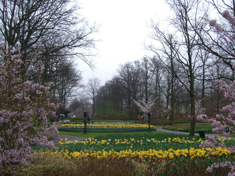
● 例