
CSSにおいて、疑似要素 ::before と ::after は、要素の内容の前後にコンテンツを追加するために使用されます。これらの疑似要素の重なり順序については、通常、次のようになります。
- 疑似要素の重なり順序
- 具体的な例
- 親要素 .box の相対的な位置に配置する
- ::before と ::after を重ね合わせる
- ::after を ::beforeの下に配置する
- スタッキングコンテキスト
- 疑似要素の前面に要素が表示されない
- まとめ
疑似要素の重なり順序
::before疑似要素が、その要素の実際のコンテンツの直前に配置されます。- 要素の本体(テキストや他のコンテンツ)が続きます。
::after疑似要素が、その要素の実際のコンテンツの直後に配置されます。
この配置により、::before が要素の内容よりも先に、そして ::after が内容よりも後に表示されるため、視覚的に ::before が ::after よりも先に来ることになります。

具体的な例
以下は ::before と ::after を使用したHTML要素のスタイリングの例です。
<div class="box">Content</div>.box {
position: relative;
width: 200px; /* 任意のサイズ */
height: 100px; /* 任意のサイズ */
background: lightblue; /* 背景色 */
color: white; /* テキスト色 */
text-align: center; /* 中央寄せ */
line-height: 100px; /* ラインハイトをboxの高さと同じに */
}
.box::before{
content: "";
position: absolute;
width: 50px; /* 四角形の幅 */
height: 50px; /* 四角形の高さ */
background: red; /* 背景色 */
}
.box::after {
content: "";
position: absolute;
width: 50px; /* 四角形の幅 */
height: 50px; /* 四角形の高さ */
background: blue; /* 背景色 */
}

親要素 .box の相対的な位置に配置する
疑似要素を親要素 .box の相対的な位置に配置してみます。
<div class="box">Content</div>.box {
position: relative;
width: 200px; /* 任意のサイズ */
height: 100px; /* 任意のサイズ */
background: lightblue; /* 背景色 */
color: white; /* テキスト色 */
text-align: center; /* 中央寄せ */
line-height: 100px; /* ラインハイトをboxの高さと同じに */
overflow: visible; /* 子要素が外にはみ出るのを許可 */
}
.box::before {
content: "";
position: absolute;
width: 50px; /* 四角形の幅 */
height: 50px; /* 四角形の高さ */
background: red; /* 背景色 */
top: 0px; /* boxの上部からの相対位置 */
left: 0px; /* boxの左端からの相対位置 */
}
.box::after {
content: "";
position: absolute;
width: 50px; /* 四角形の幅 */
height: 50px; /* 四角形の高さ */
background: blue; /* 背景色 */
bottom: 0px; /* boxの下部からの相対位置 */
right: 0px; /* boxの右端からの相対位置 */
}
このコードは、四角形が .box 要素の端に合わせて配置されるようにしています。
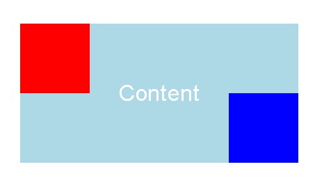
このスタイル設定により、.box というクラスを持つ要素の上部左端に赤い四角形、下部右端に青い四角形が表示されるようになっています。これらの四角形は、position: absolute; によって、親要素 .box の相対的な位置に配置されています。そのため、.box の position: relative; がこれらの疑似要素の配置の基準点となっています。
::before と ::after を重ね合わせる
このCSSスタイル設定では、.box クラスを持つ要素内に2つの四角形(赤と青)を表示しています。
続きはこちら